01
Mission 1
Smarty+ — Orange mobile app
Context
The project?
BNP Paribas Cardif is the group's insurance and protection subsidiary. Smarty+ is a mobile app for testing a phone's condition, either to resell it or when subscribing to mobile insurance — a journey built in partnership with Orange.
Following a rising mobile insurance fraud rate, the app's experience and design were entirely reworked.
My role?
- I ran user tests on the existing app, with a panel split into two distinct groups and a focus group at the end of the session.
- I built a customer journey mapping based on the test results and exploratory interviews.
- I designed a first flow incorporating nudge concepts, then a second flow with UI improvements.
- I tested the new flows with users, then extended the audit to the whole subscription journey (before/after the app).
Exploration & research phase
The context?
First, we wanted to understand how users went through the flow to test their phone's condition, and also whether it was actually possible to cheat and bypass the tests in the flow.
My role?
I set up a two-part workshop:
- Individual tests split into 2 groups of six people:
- Group 1, 2 scenarios (first as an honest person, then as a fraudster).
- Group 2, a single scenario, as a fraudster.
- A joint focus group bringing all participants together to discuss the experience they'd had.
Outcome?
In total, 13 types of fraud were attempted, and more than half worked. What we mainly took away was that while fraud was indeed possible in the tests, discouragement among genuine users also existed: the flow could be long, with no sense of steps, so drop-off could be frequent.
50%
Managed to reach the insurance subscription with a broken phone
8
Types of fraud worked within the flow
40%
Of participants found the full flow too long
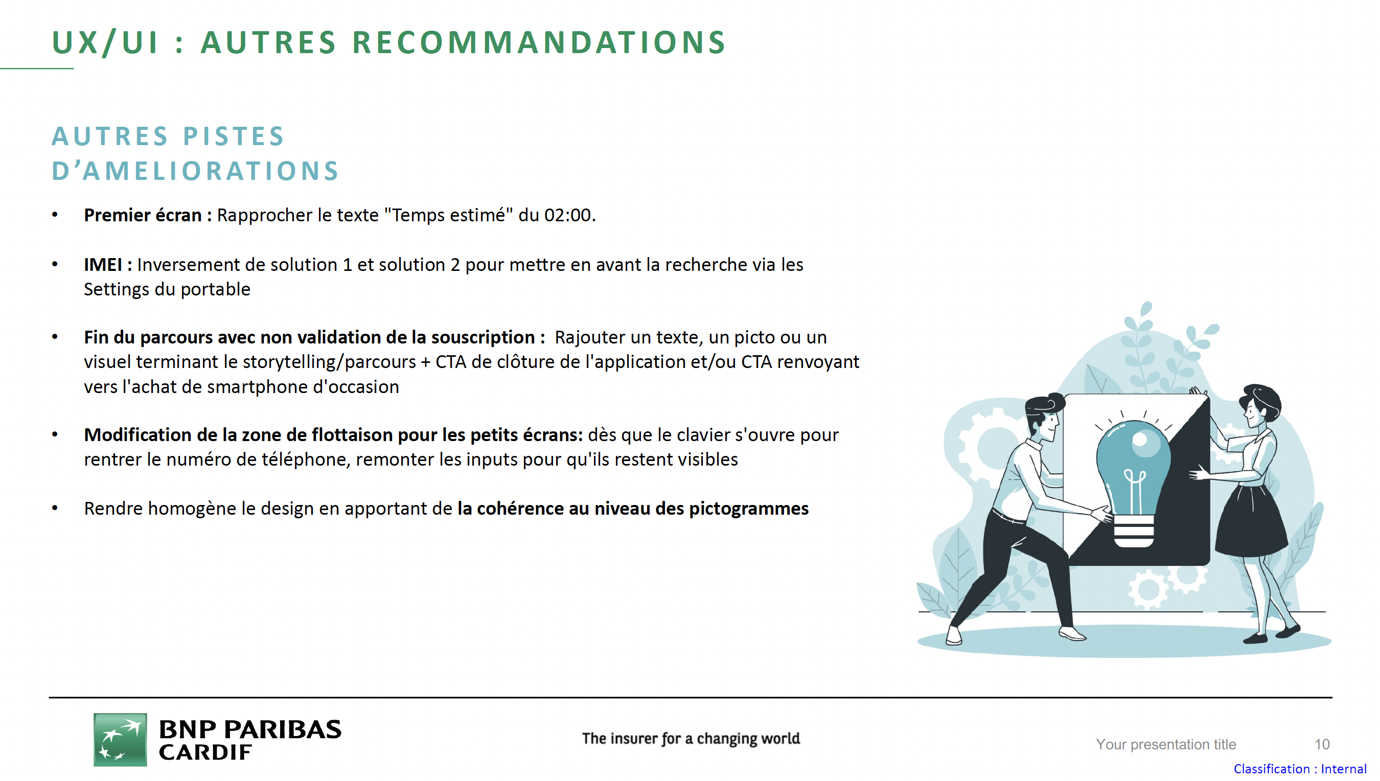
UX/UI — other improvement ideas.
Building a customer journey mapping
My role?
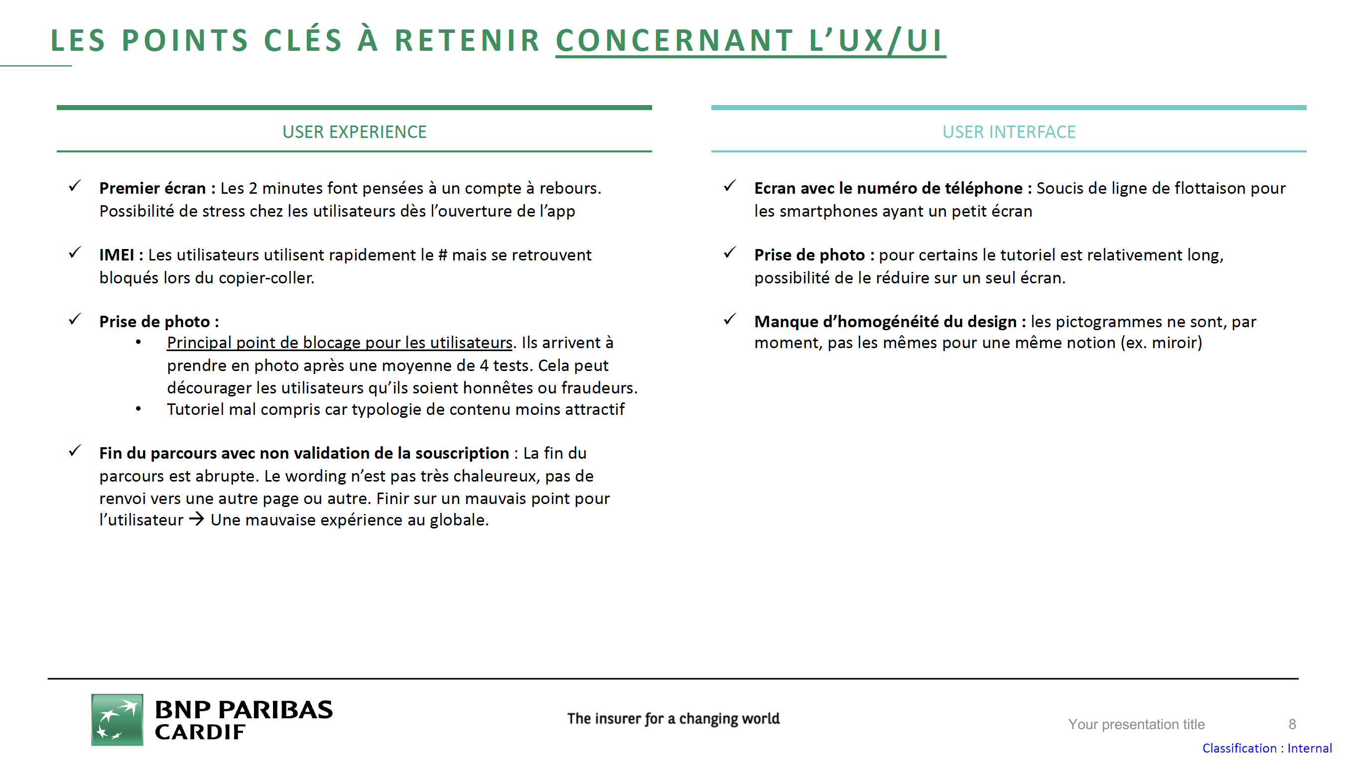
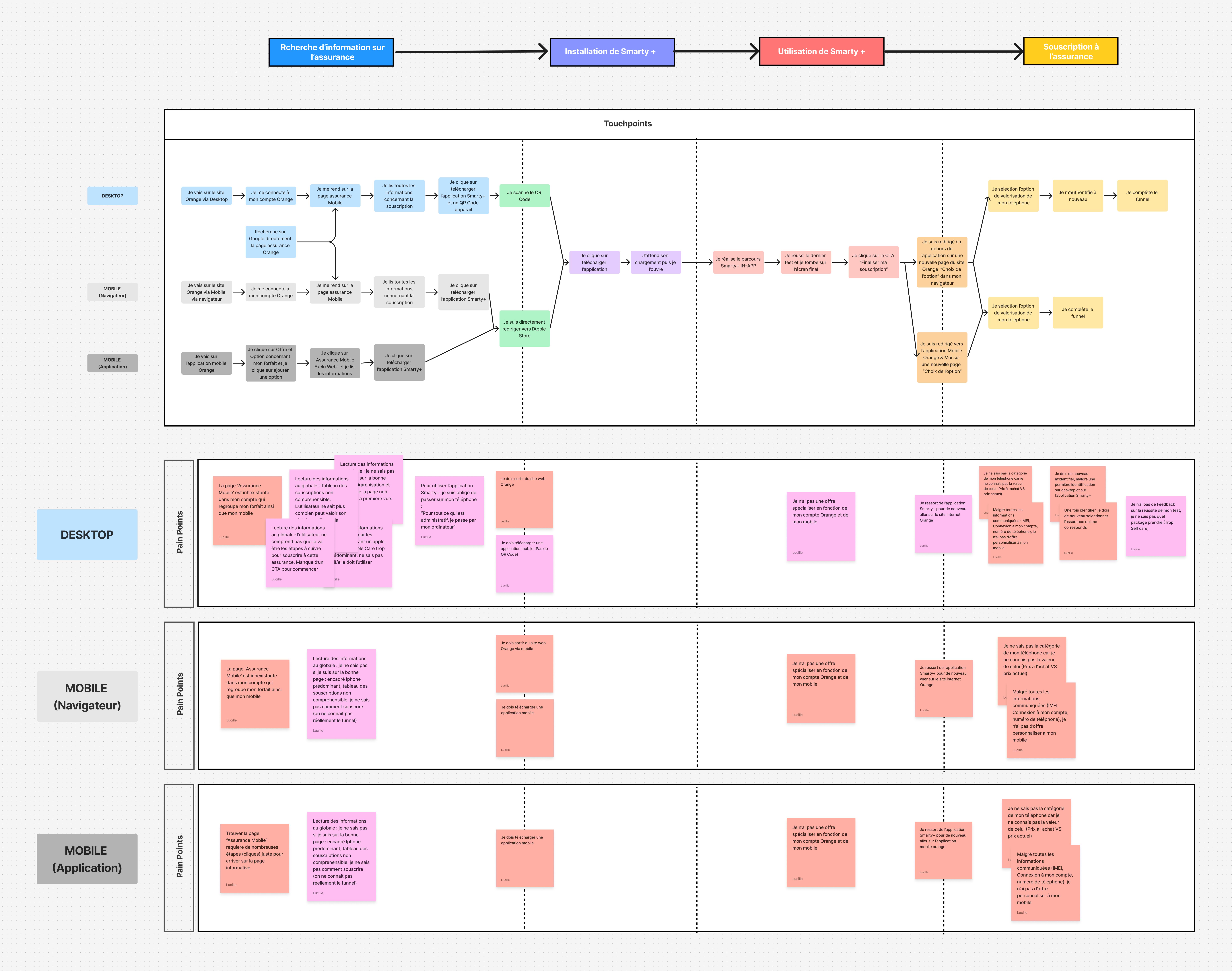
Following the observation and testing phase, I built a customer journey mapping to understand the user's overall journey and the pain points that emerged. Observations revealed usability gaps at certain steps, as well as user discouragement in completing the flow.
Customer journey mapping — Desktop, Mobile (browser) and Mobile (app), with pain points identified at each step.
Building two mockup flows
My role?
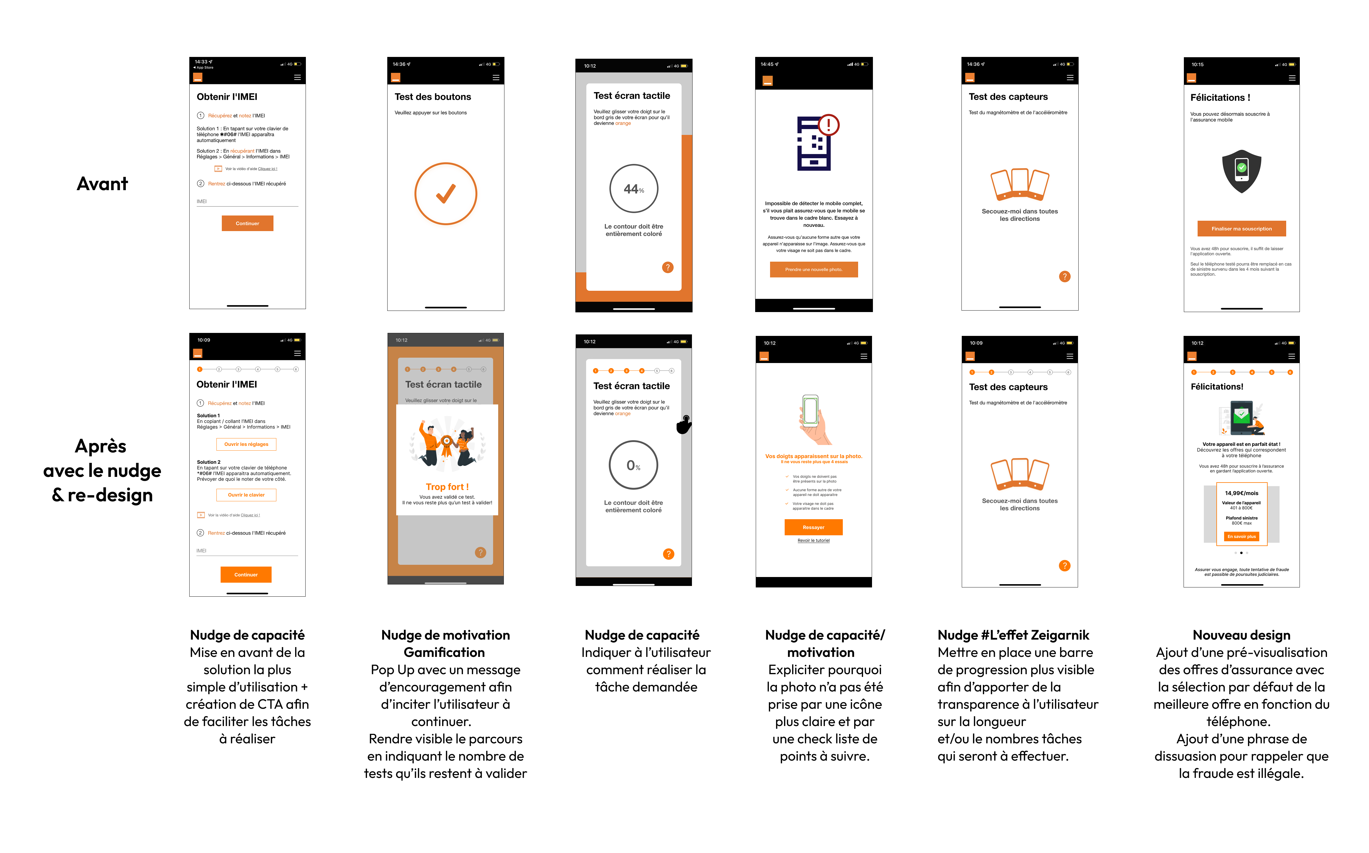
First, I built a flow incorporating nudge concepts, with no design changes, to discourage fraud and encourage users to complete the flow. Then, I added design improvements to avoid visual friction that could hurt the experience.
Before/after mockups incorporating different nudge concepts — capability, motivation, gamification, Zeigarnik effect, and new design.
User tests (A/B testing) of the two new flows
Outcome?
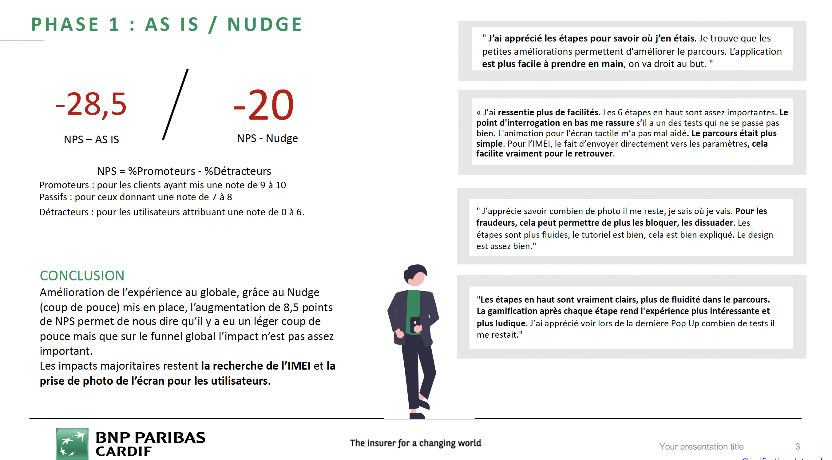
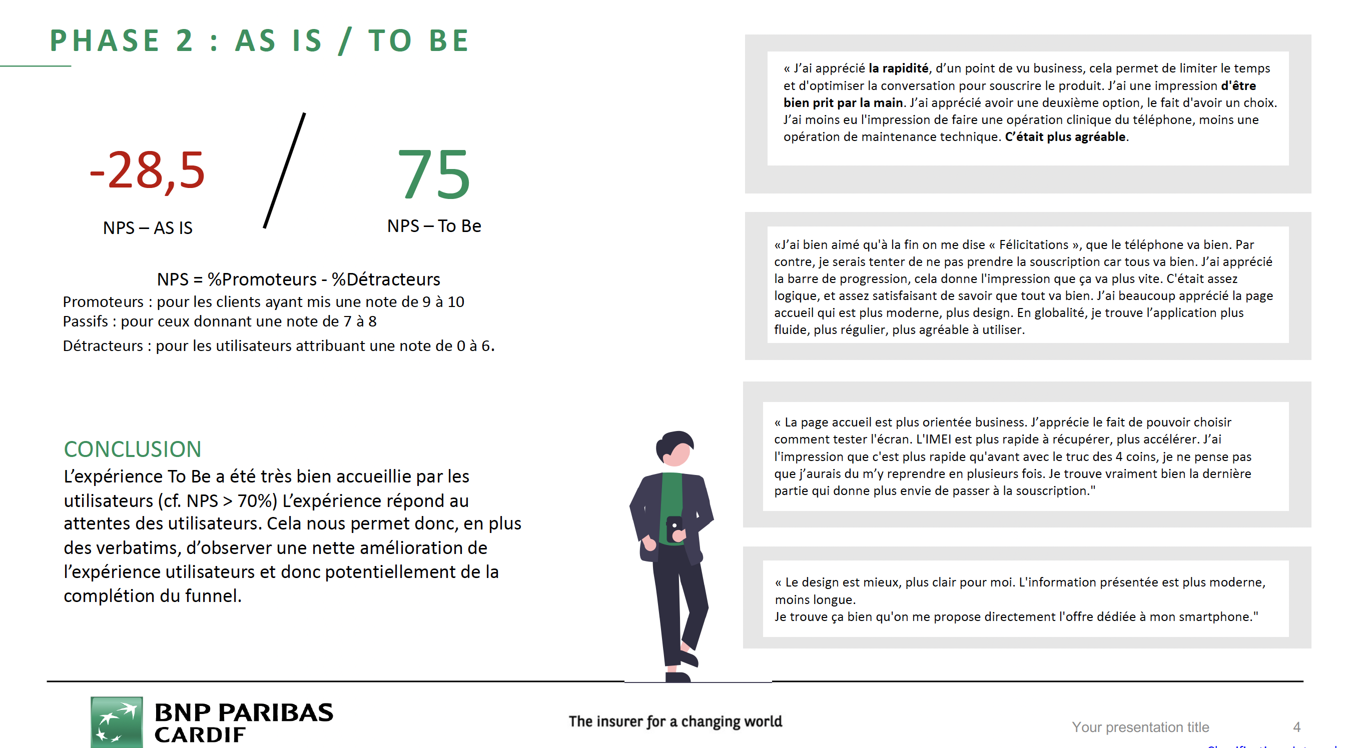
A/B tests were run on a panel of 8 users, across 3 phases (introduction, think-aloud scenario on both flows, usability questionnaire). The To Be experience was very well received (NPS > 70%), with a clear improvement over the initial flow.
-28.5
NPS of the initial flow (As Is)
-20
NPS after adding the Nudge
75
NPS of the To Be flow, with UI redesign
Phase 1 — As Is / Nudge: NPS from -28.5 to -20.
Phase 2 — As Is / To Be: NPS from -28.5 to 75.
Going further, full-journey audit
My role?
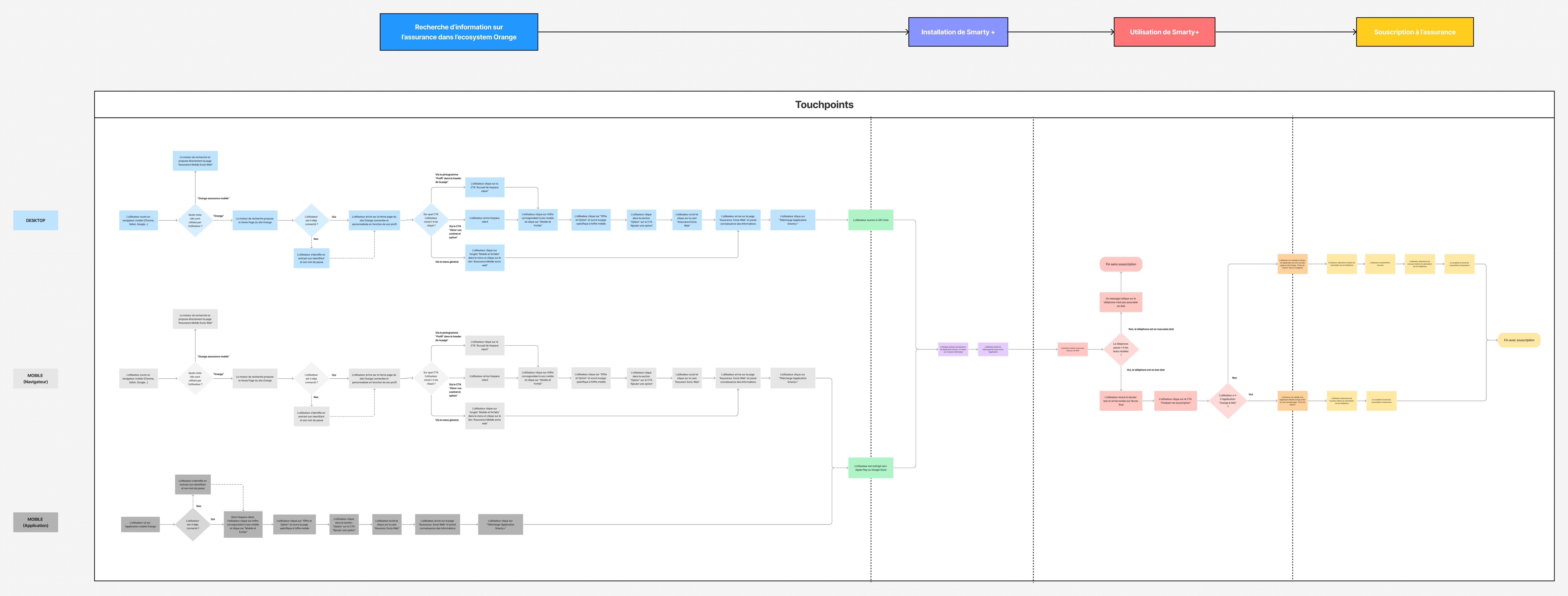
By studying the mobile insurance subscription customer journey mapping as a whole, factoring in the user's actions before and after entering the app, we went further in our recommendations to Orange: pain points also emerged upstream and downstream of the in-app flow.
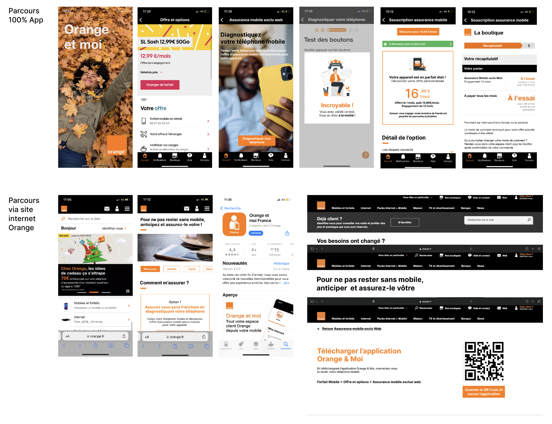
Full-journey audit — from researching information on the Orange site to insurance subscription.
Proposing three different user flows
My role?
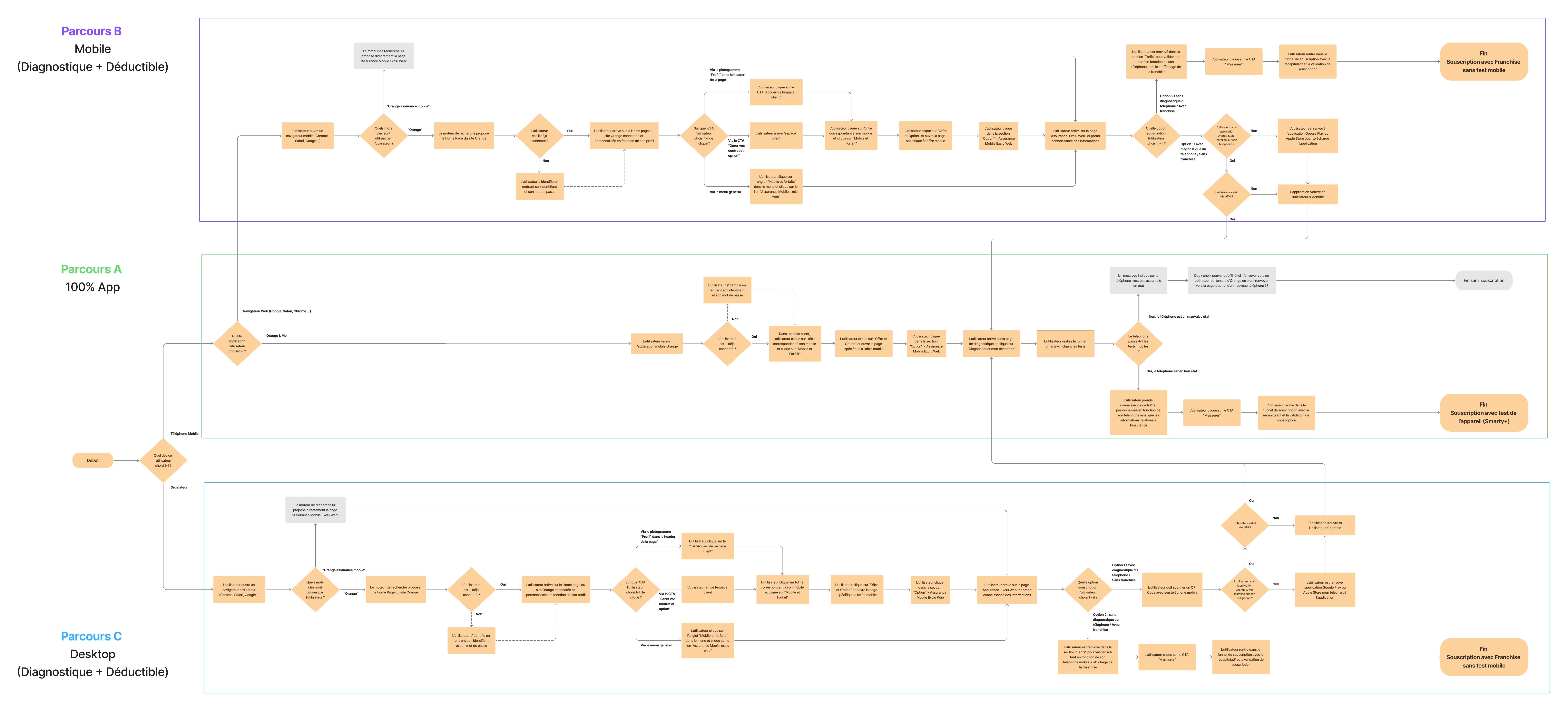
Exploratory interviews and tests revealed that one of the main pain points was switching between screen formats. By rethinking the full flow, I proposed three options: a 100% mobile flow integrating Smarty+ within the Orange & Moi app, a flow starting on the Orange website on mobile, and a flow starting on the Orange website on desktop.
Three proposed user flows — A. 100% App, B. Mobile (diagnostic + deductible), C. Desktop (diagnostic + deductible).
Clickable prototypes & new-flow testing
My role?
For each proposed flow, I built clickable prototypes reusing Orange's visual identity and editorial style, to test each hypothesis under near-real conditions.
Outcome?
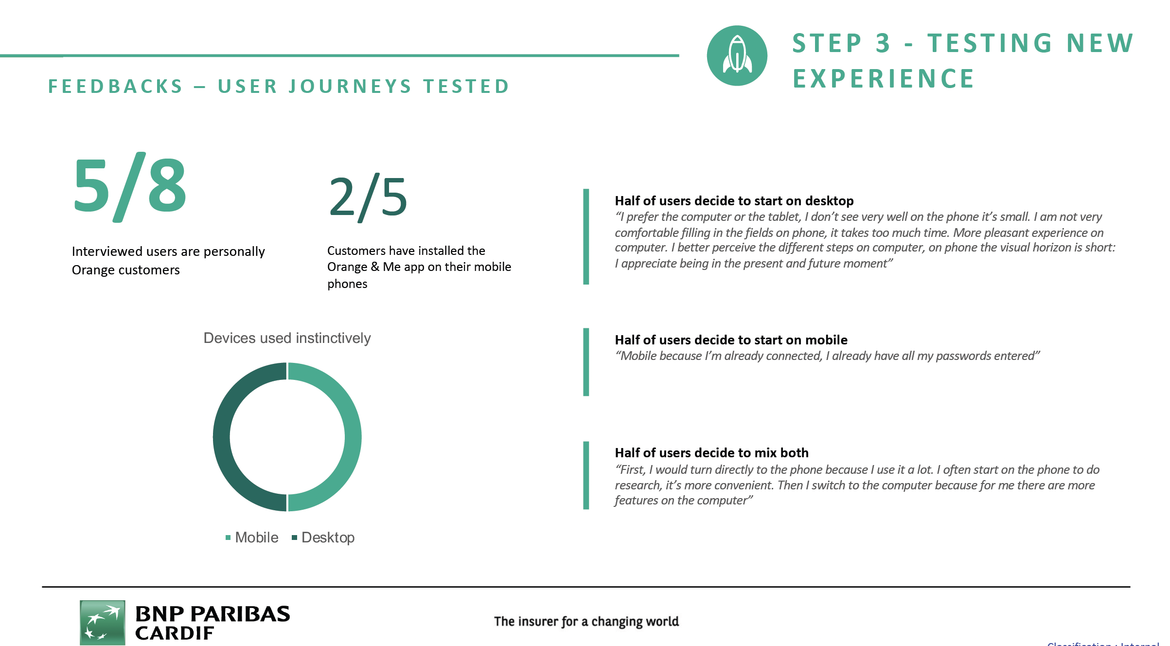
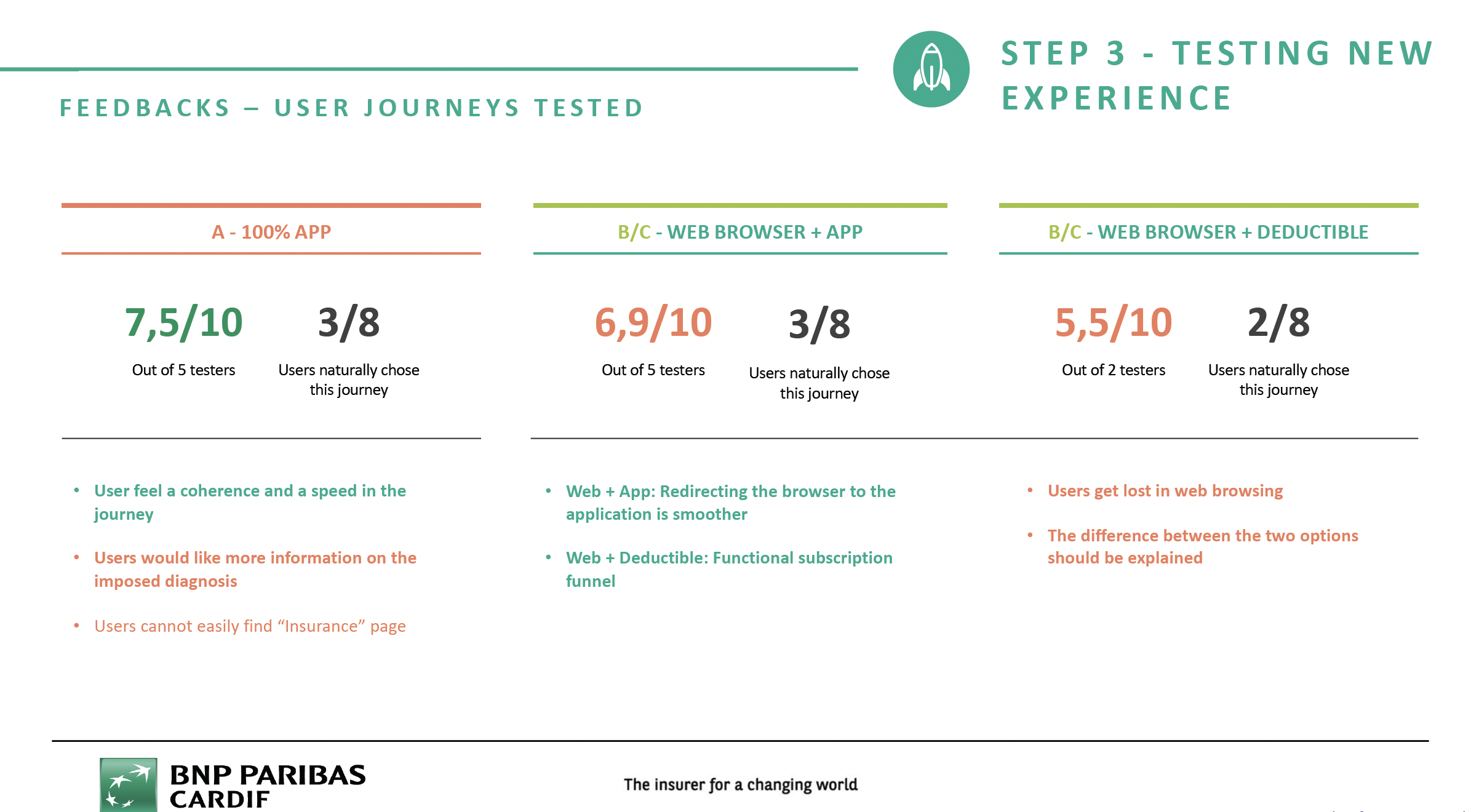
Tests were run on a panel of 8 users, in think-aloud mode, with a free choice of screen format (desktop or mobile) to start their flow. Flow A (100% App) came out as the most coherent and fastest for users, with the highest score (7.5/10).
7.5/10
Score for Flow A — 100% App
6.9/10
Score for Flow B/C — Web browser + App
5.5/10
Score for Flow B/C — Web browser + Deductible
Clickable prototypes — 100% App flow and flow via the Orange website.
Devices used instinctively and user verbatims.
Scores and feedback per tested flow — A, B/C.
02
Mission 2
Spread — internal innovation platform
Context
The project?
Spread is an internal website for cataloguing innovations carried out across BNP Paribas Cardif worldwide. The site already existed but wasn't meeting its goals: unnatural day-to-day use, an unclear value proposition, and a dated UI.
My role?
- I conducted an audit and exploratory interviews on the existing site to understand usage patterns and pain points.
- I designed the new site, including a new value proposition, to make daily use of the site easier.
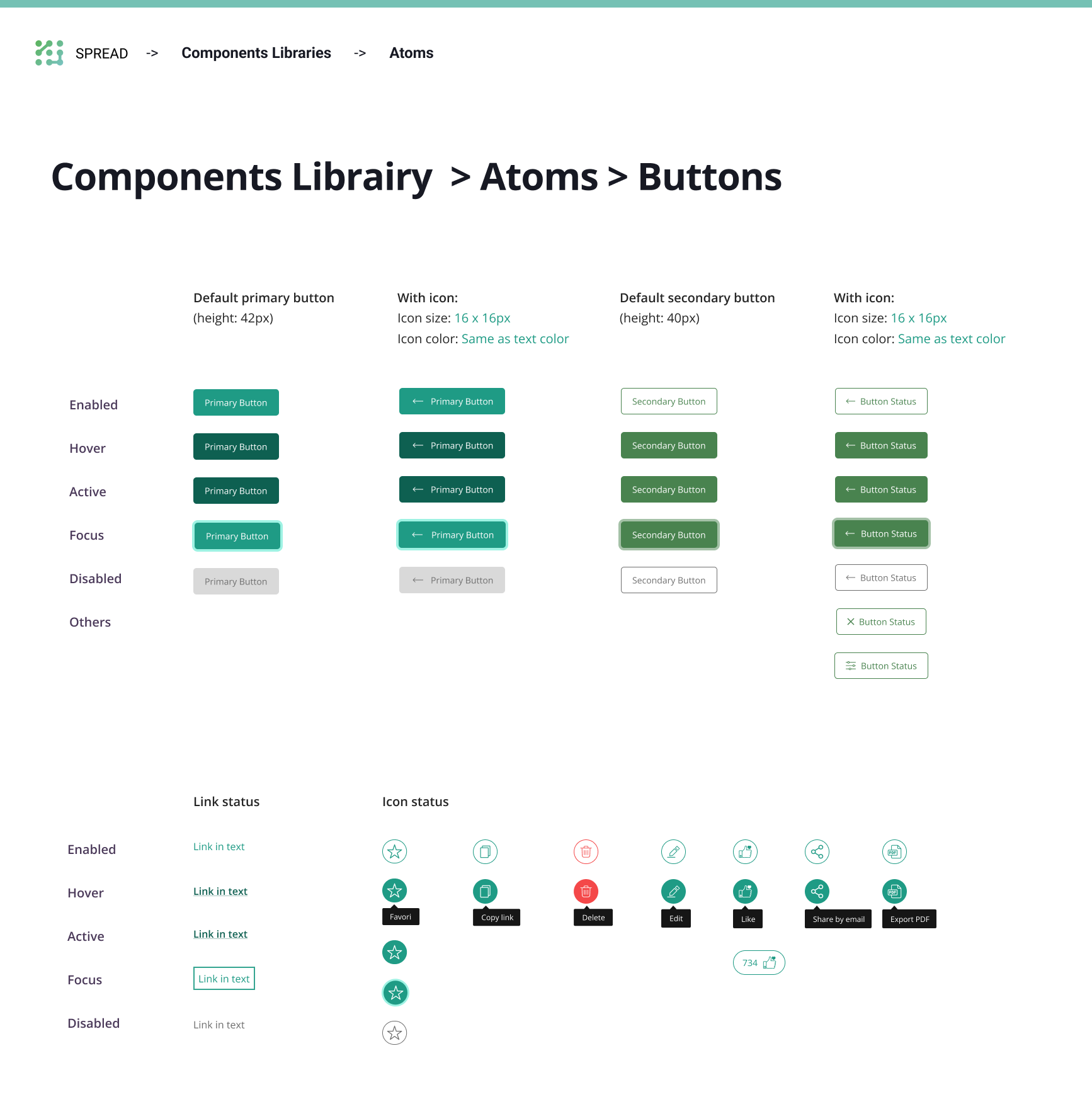
- I created a design system supporting the site's UI and interactions, working directly with the developer in charge of the site.
Spread design system
Outcome?
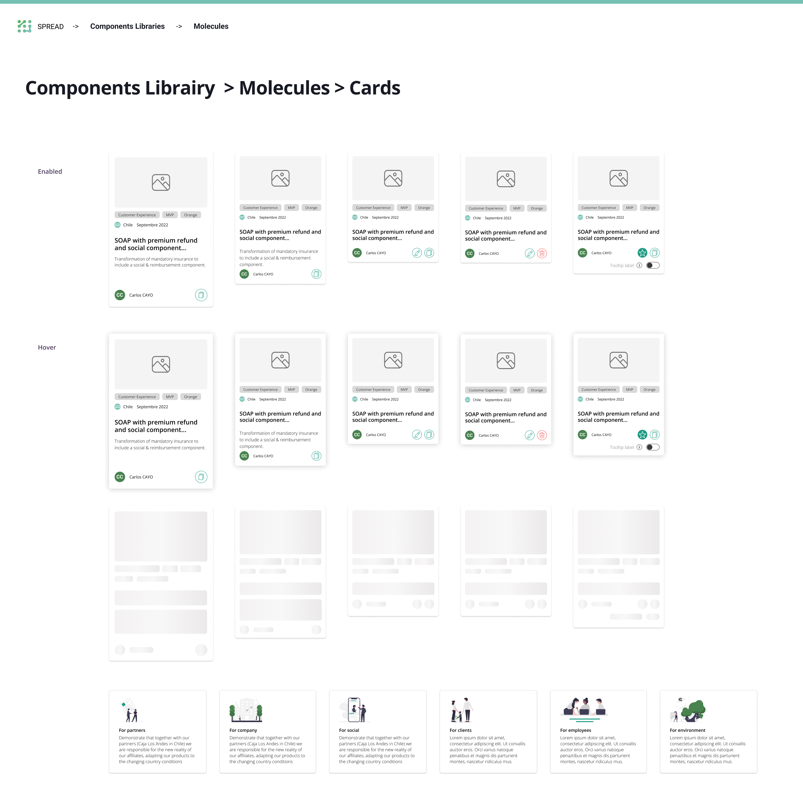
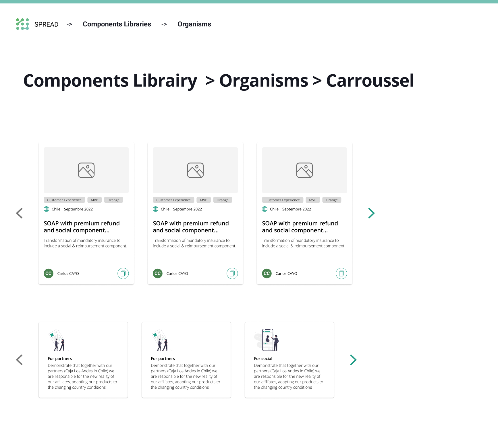
A complete design system was delivered to the developer to support the redesign: colors and gradients, typography, atomic components (buttons, tabs) and more complex components (cards, textarea, carousel, progress bar).
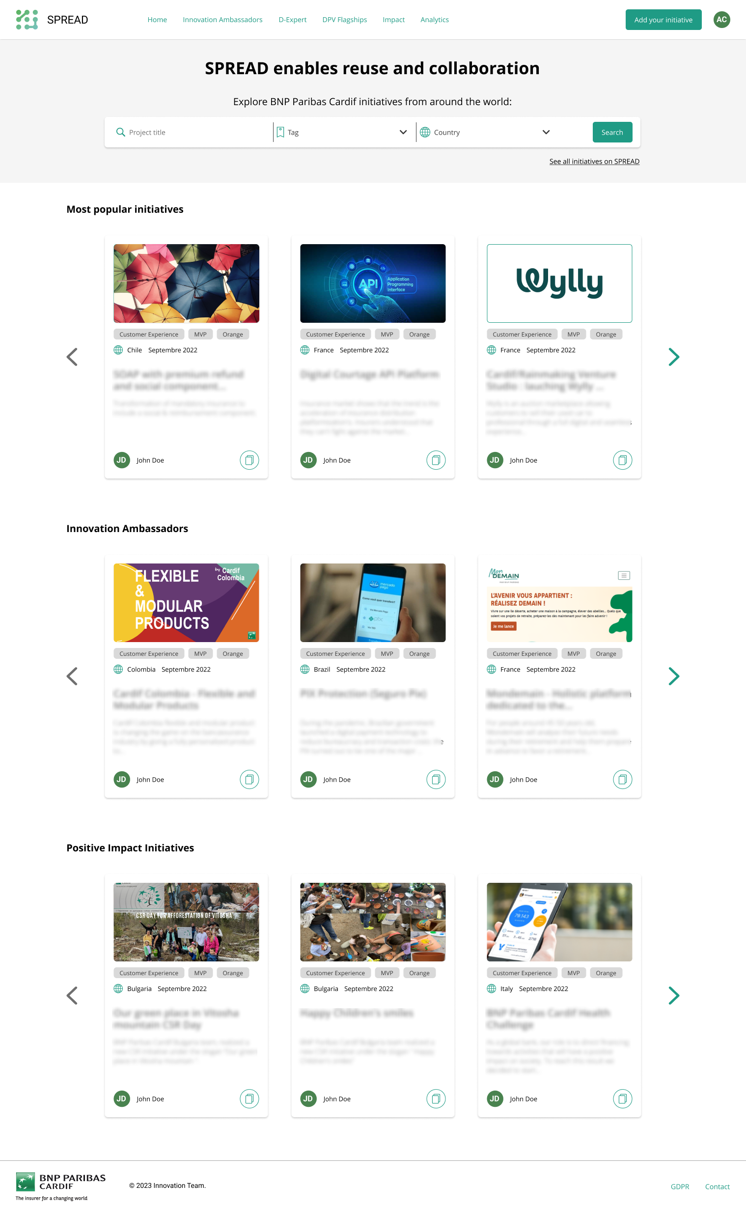
Final preview of the Spread homepage.