Opencellsoft is a startup in the billing space, founded in 2015. It offers an agile monetization platform that lets recurring-revenue companies quickly launch new services, monetize new revenue streams, and deliver an improved customer experience.
Context
The project?
Mocking up the screens in the target flow
The context?
As part of a user experience review on a defined flow, I worked with the product and IT teams on creating mockups. Before I joined, the product team had already worked on redesigning several existing flows to make the user experience easier.
My role?
I based my work on these existing user flows to build the first screens. As the work progressed, I was able to bring, alongside my UI design skills, UX design input to improve these flows.
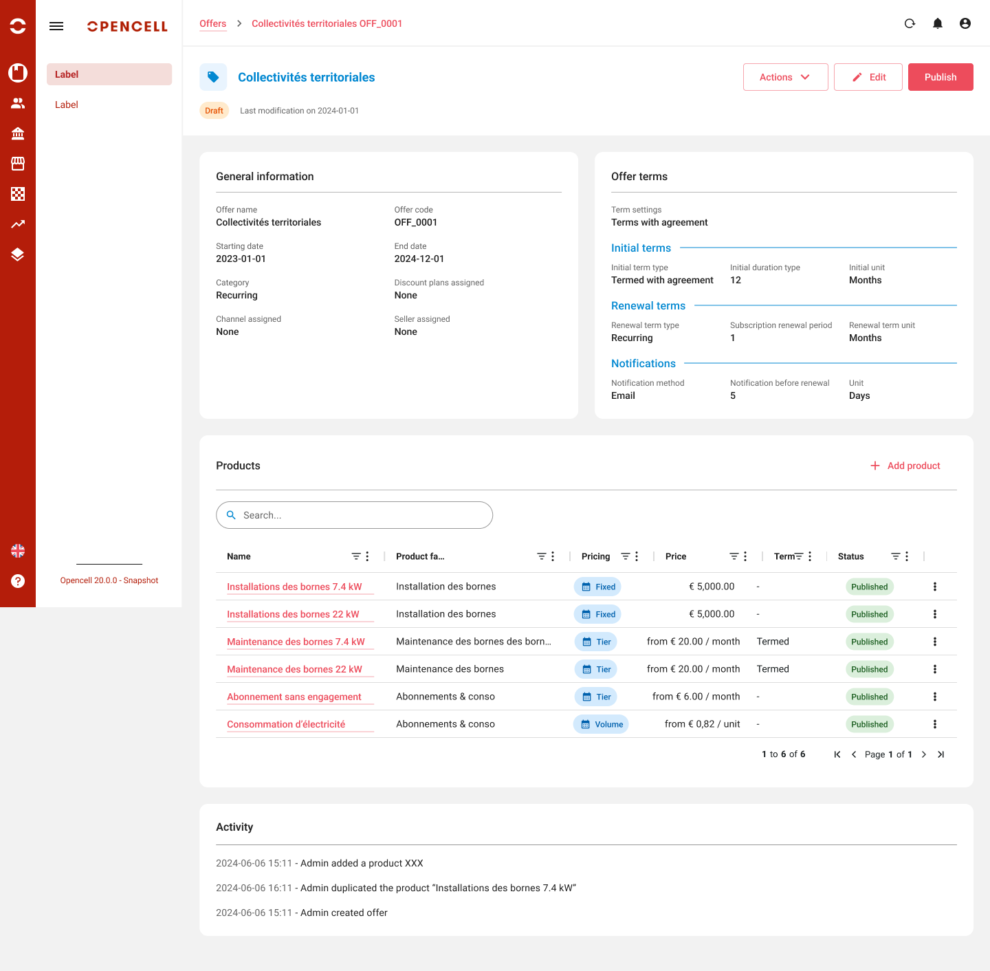
Offer sheet — view mode.
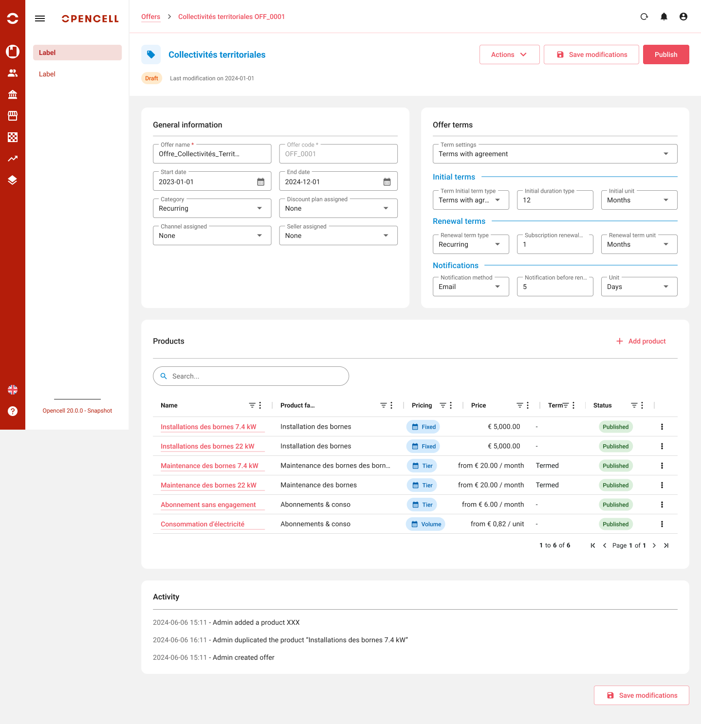
Offer sheet — edit mode.
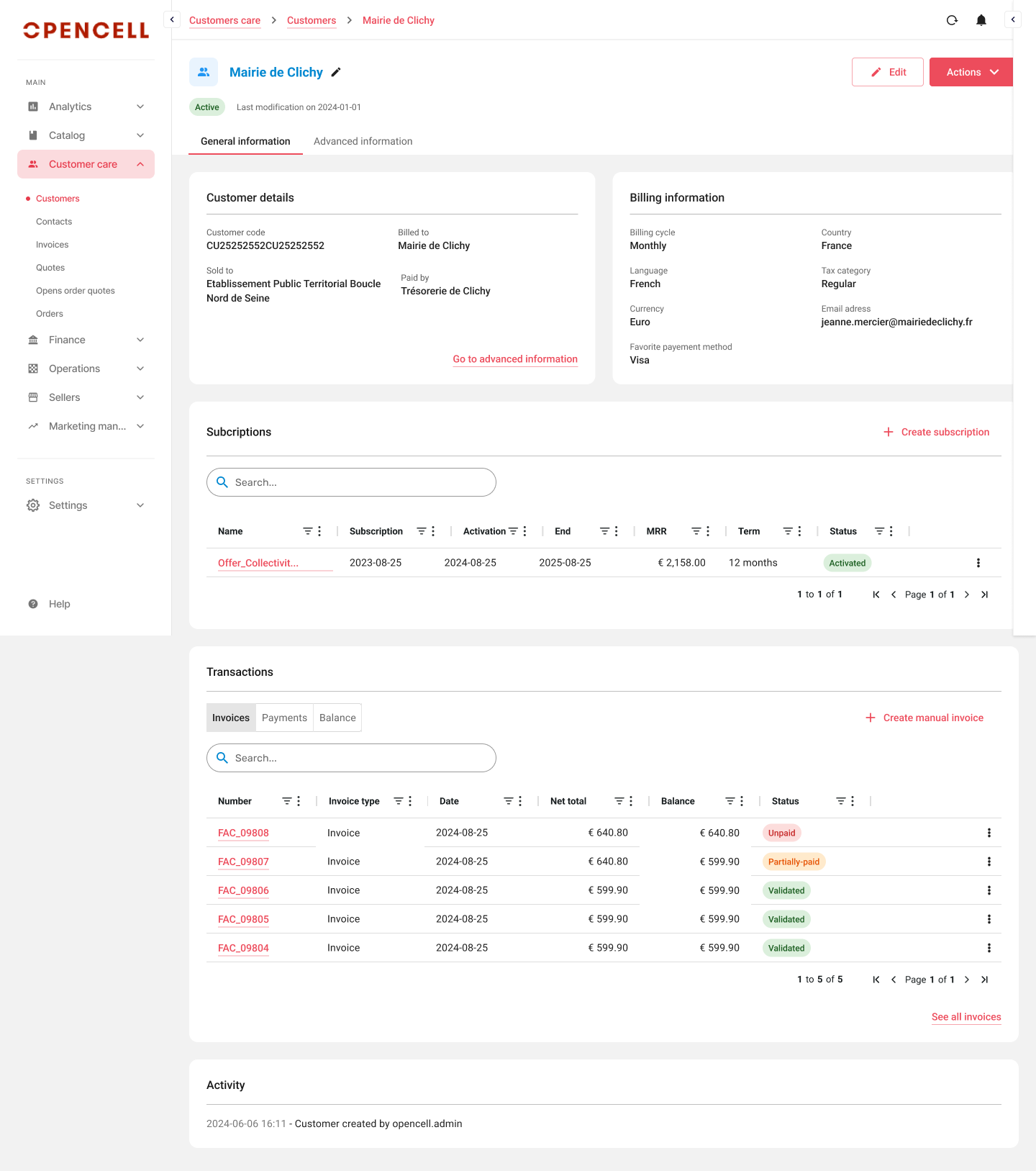
Customer page — general information, subscriptions and transactions.
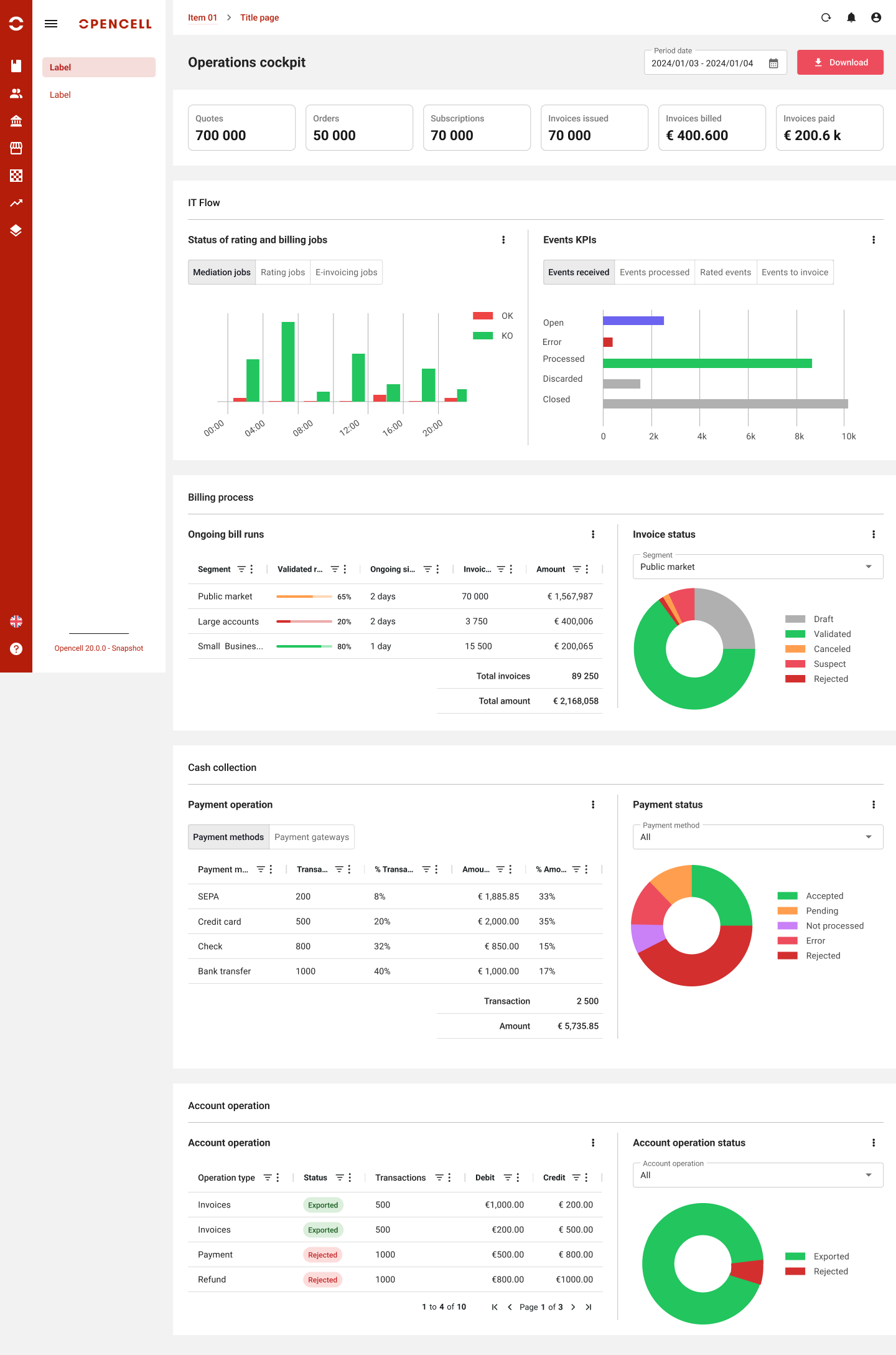
Operations cockpit — tracking IT flows, billing, collections and account operations.
Building a design system
My role?
Alongside the designed screens, I created a design system in parallel to standardize the design and behavior of components across the whole platform. This design system was built using the atomic design method and created in collaboration with front-end developers. The libraries used are MUI v6, AG Grid and Chart.JS.
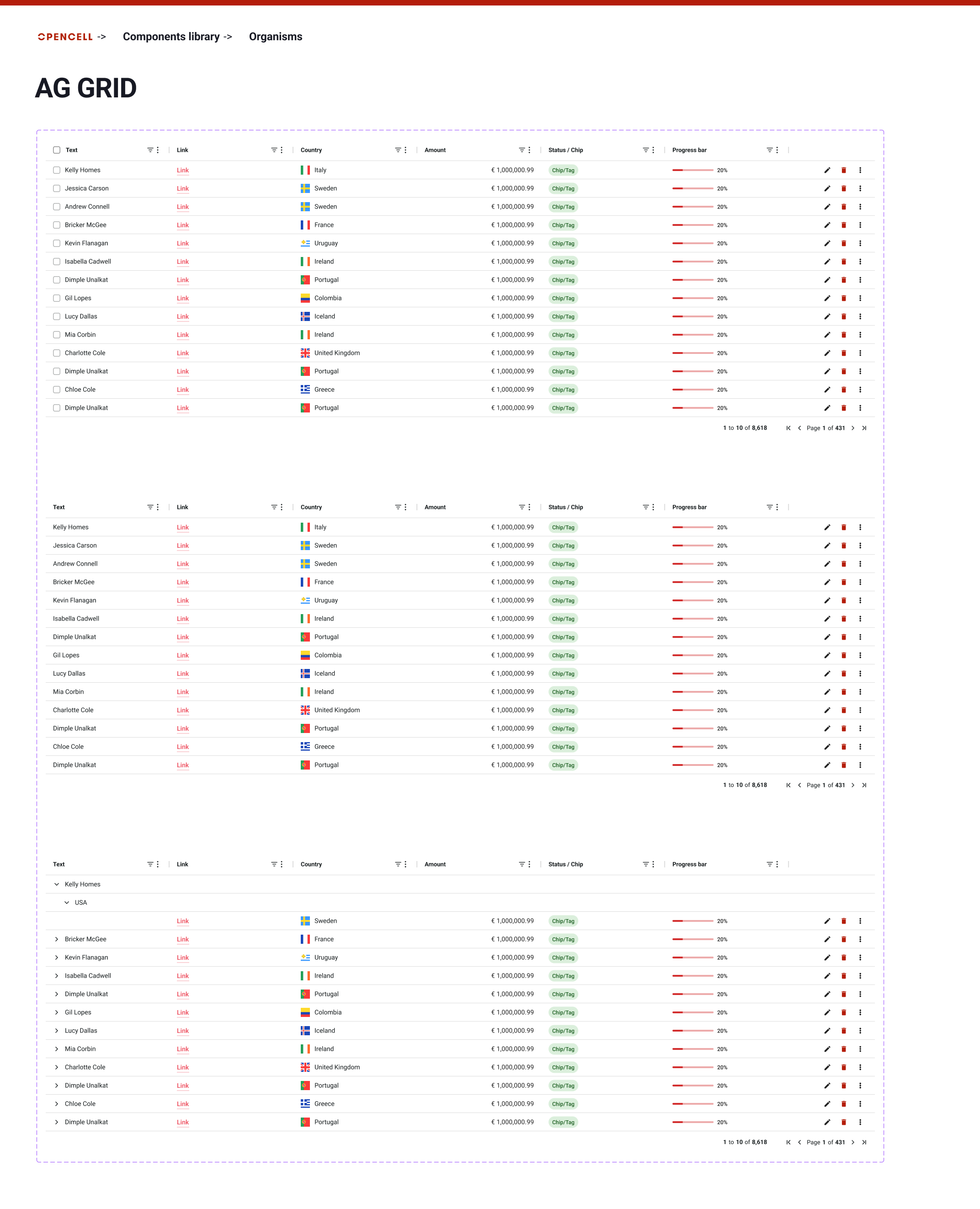
Organism — AG Grid, Opencell's main data table.
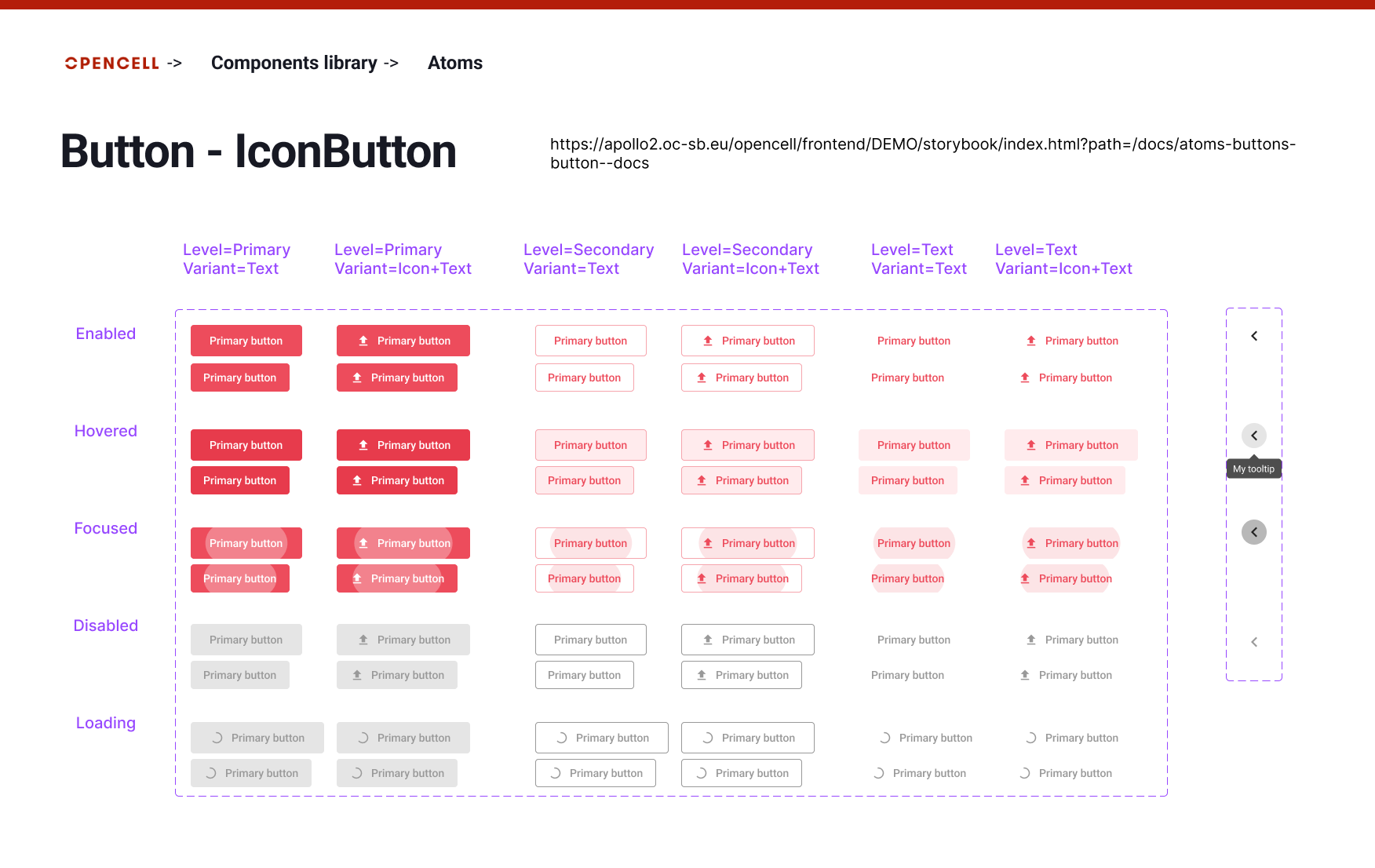
Atom — Button / IconButton.
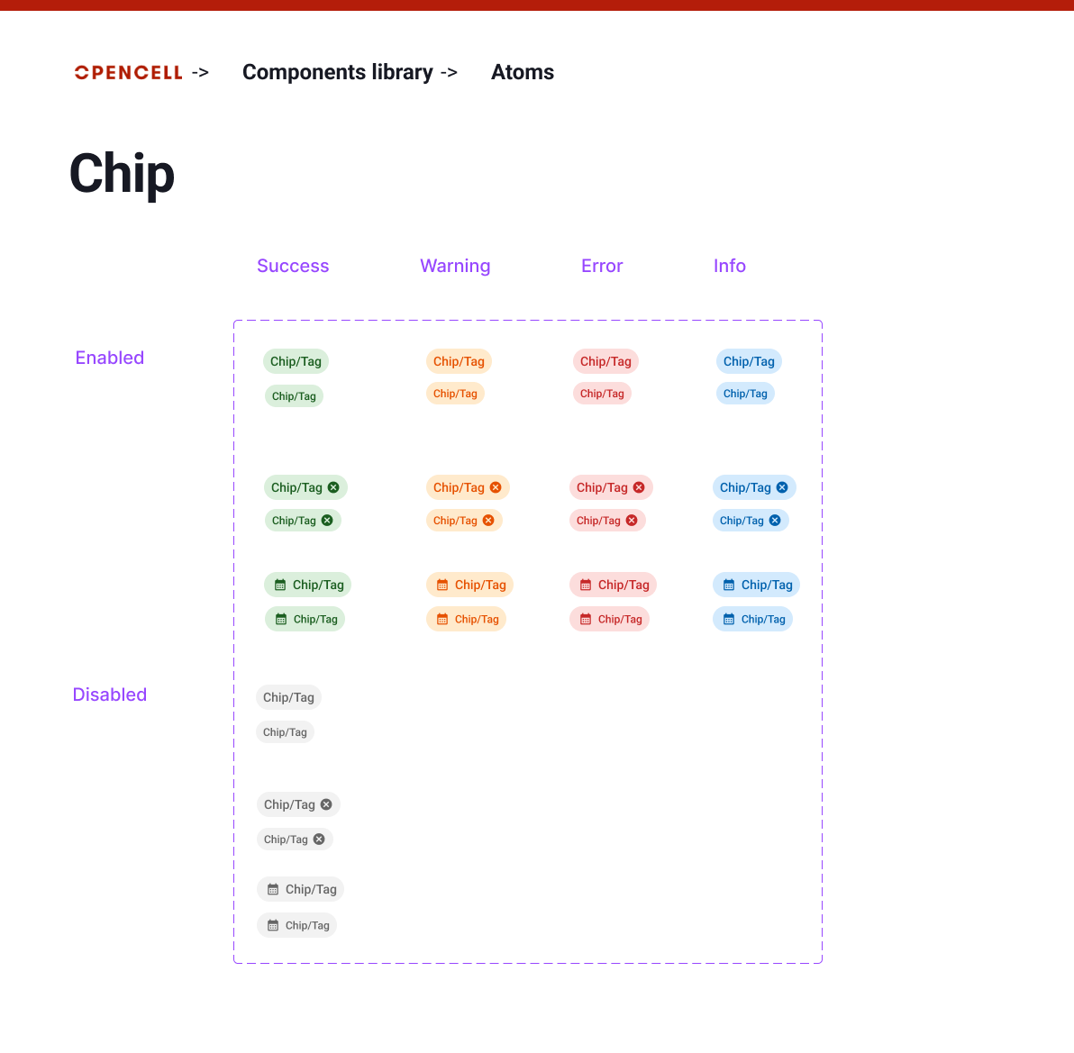
Atom — Chip.
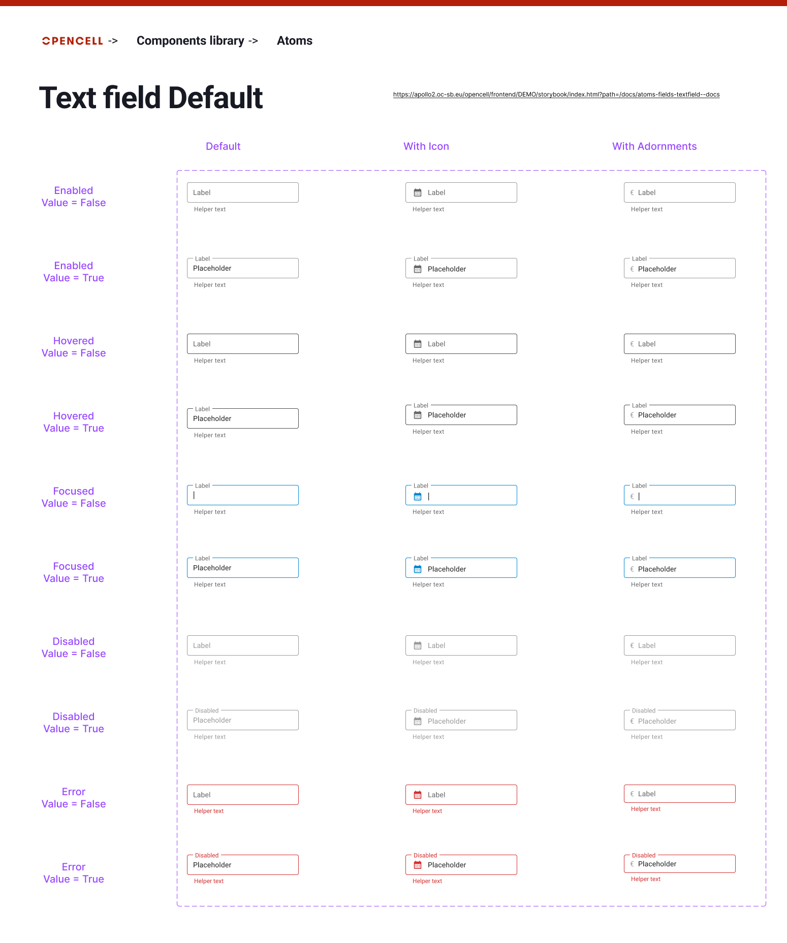
Atom — Text field.
Figma training for the teams
The context?
As Figma wasn't yet in use at Opencellsoft, I led training sessions for the product teams.
My role?
The goal was for the product team to then be able to easily use Figma to modify or quickly create screens using the design system. As for the IT team, this gives them easy access to the design system for the Storybook build, currently underway.
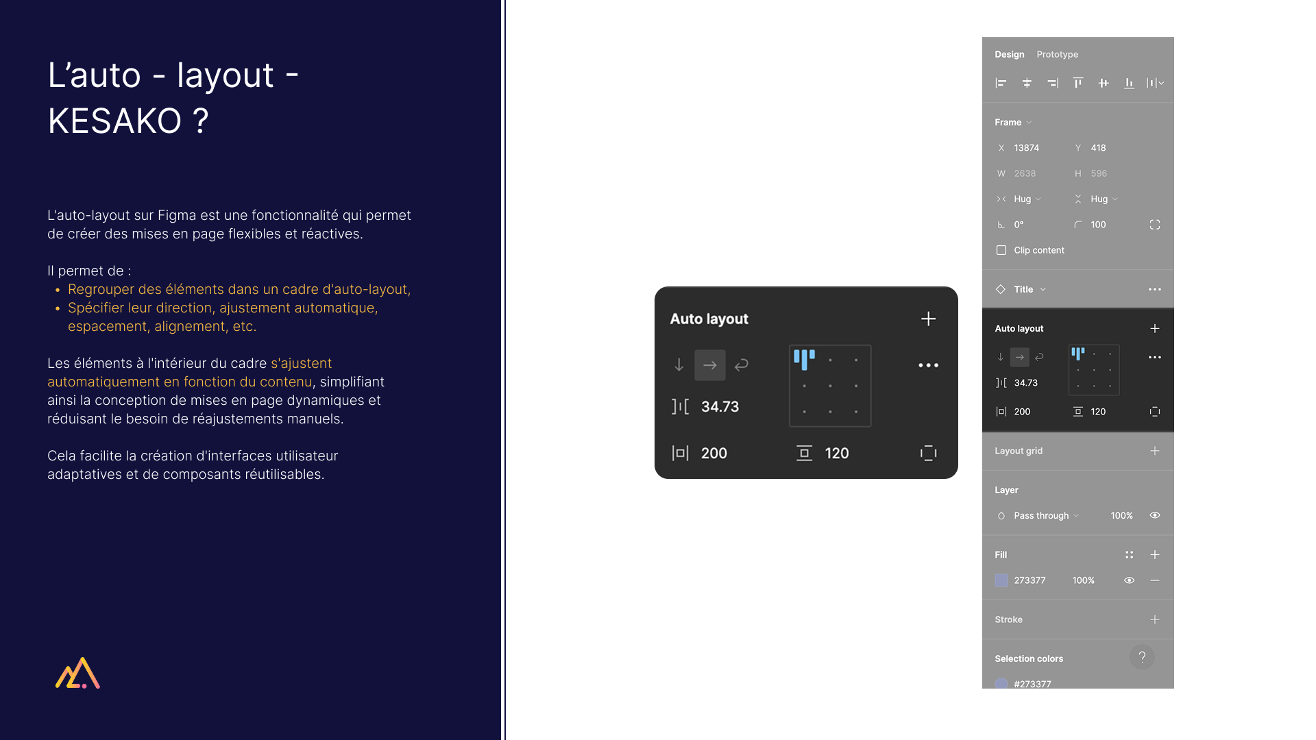
Training material — what is auto-layout?
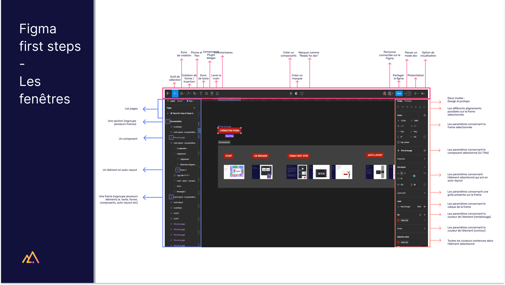
Training material — Figma first steps, the windows.
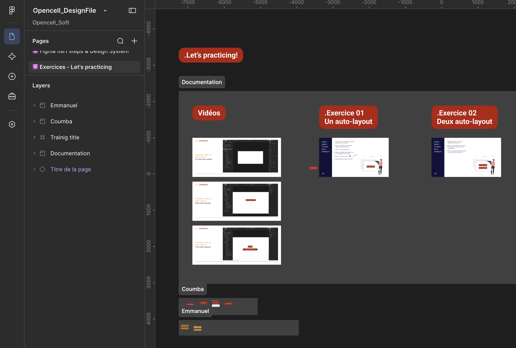
Figma file with the practice exercises completed by the teams.